Charting and Visualization
Overview
Qarbine provides traditional business intelligence charting support to visually portray data. There are several custom cells that provide such options.
 SparkLine
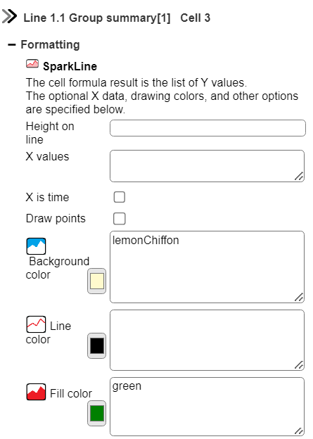
The cell formula result is the list of Y values. The optional X data, drawing colors, and other options may be specified as well.
The unique custom cell properties are shown below.
Below is an example of using a sparkline custom cell to provide a visual of the sales over time by region. This template can be found at “example/Custom cells/Sales report with sparkline”.
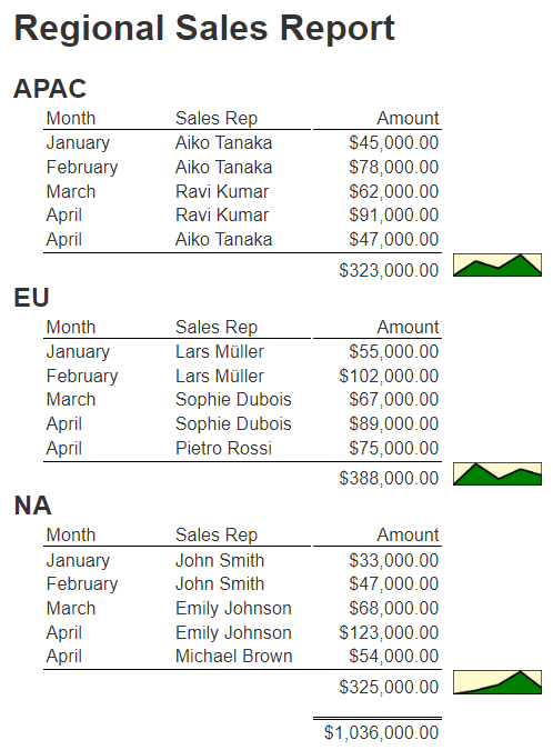
In this template the data is grouped by regions using a break condition on group 1.1.
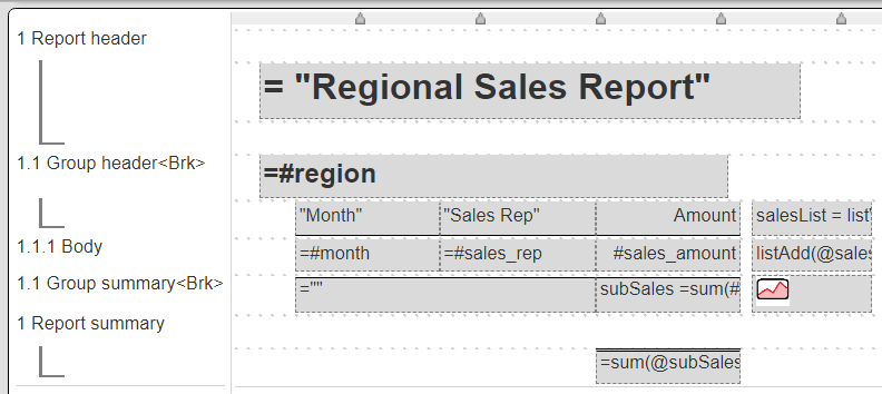
The values to plot are gathered for each group and used as input to the sparkline custom cell on the group summary line. This is accomplished with 3 cells.
The suppressed group header cell initializes the list accumulating the amounts using the formula
salesList = listWith()
The suppressed body cell adds the amount to the list using the formula
listAdd(@salesList, #sales_amount)
For the sparkline on the group summary, the formula is
= @salesList
The non default properties are

and

 Chart.js
Overview
Chart.js is a popular open source JavaScript charting library. The cell formula result is the title of the chart. Click the Properties button to edit the other settings.
This custom cell provides a large variety of charting options courtesy of the open source chart.js library. The data can come from data queries, formulas, or variables.
Basic Example
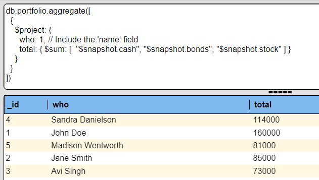
Consider the data query and its results shown below
This can be plotted in a template as shown below.
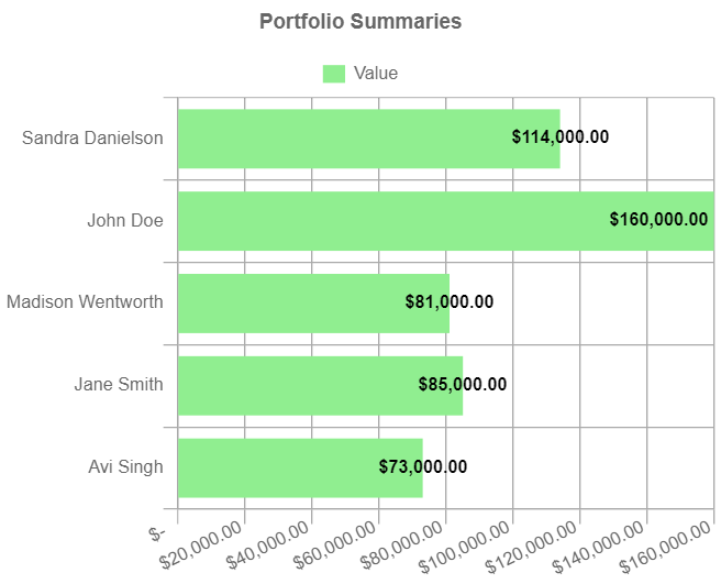
The template for this simple example is shown below.
It can be found at “ReportTemplate`example/Application/Financial services/Portfolio snapshot summaries”.
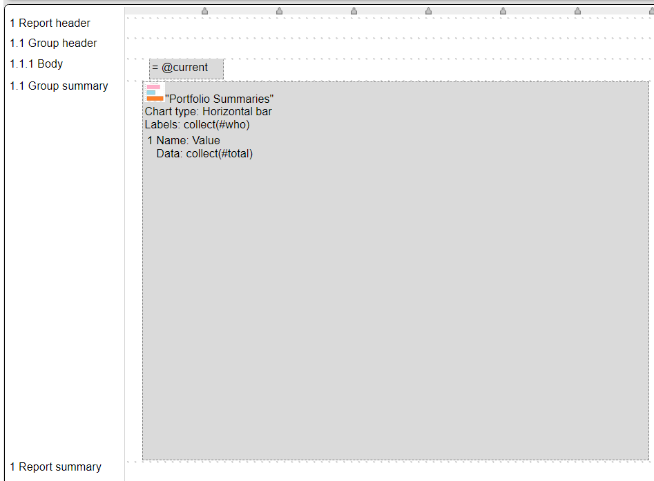
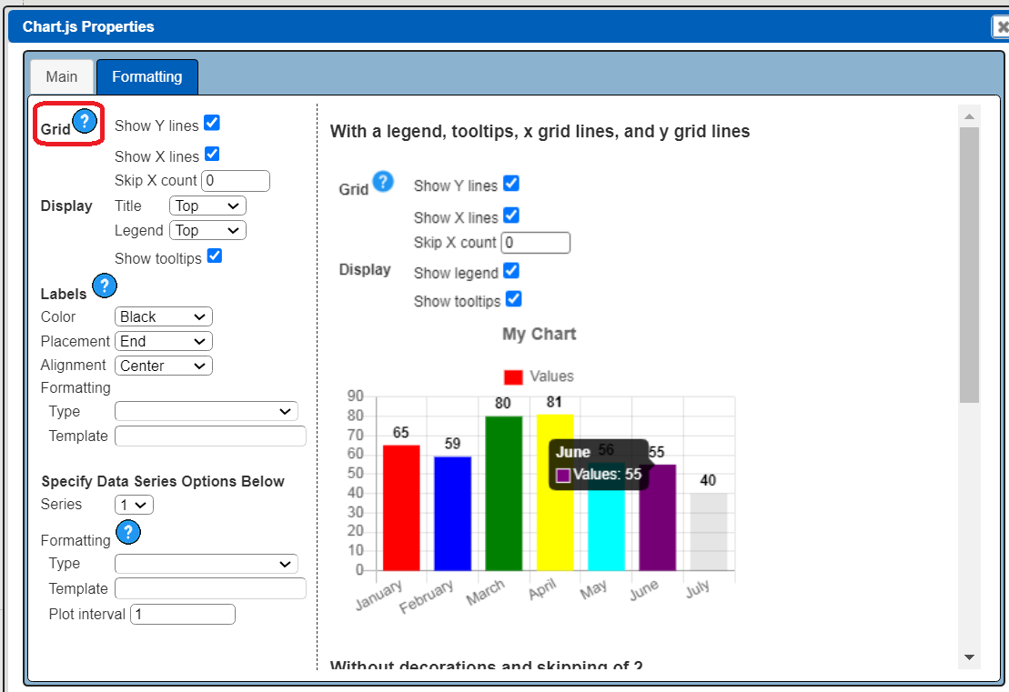
In the Template Designer when such a custom cell is selected the right hand side bar shows the following.
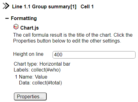
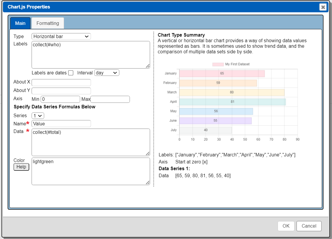
Because of the number of options available with the chart.js library, a separate dialog is used to set the chart’s properties. Click the “Properties” button to open the dialog.
The main properties tab is shown below.
The Formatting tab is shown below
The custom cell is on the group summary line.
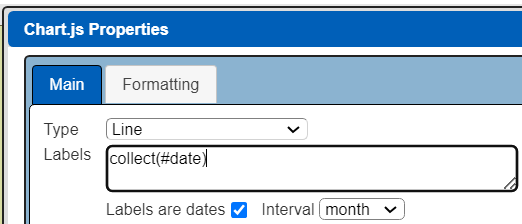
The type of chart and the formula for defining the labels are shown below.

Likewise the values to plot use a similar formula as shown below.

The collect() function is triggered as each body section is processed. The result once processing reaches the group summary is a list of labels, one per ‘who’ field value, and a list of values, one per ‘total’ value.
The other property on the main tab set is the bar chart color as shown below.

On the formatting tab we indicate that the values should be formatted using the Currency type.


Main Properties
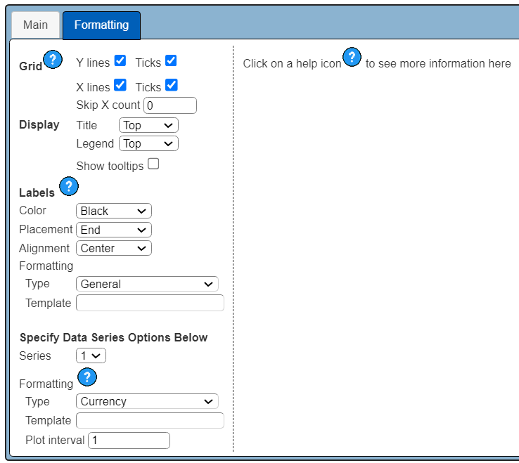
The types of charts available are shown in the dropdown below.

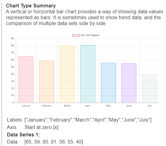
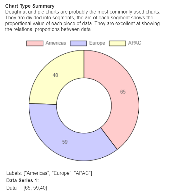
As a type is chosen the right side updates with information about using that chart type. Below are examples for a bar and doughnut chart type.
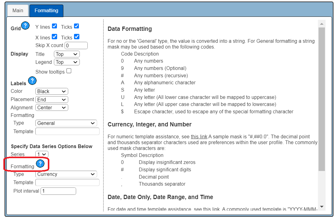
Formatting Properties
The  icons on this tab provide additional information on the associated property.
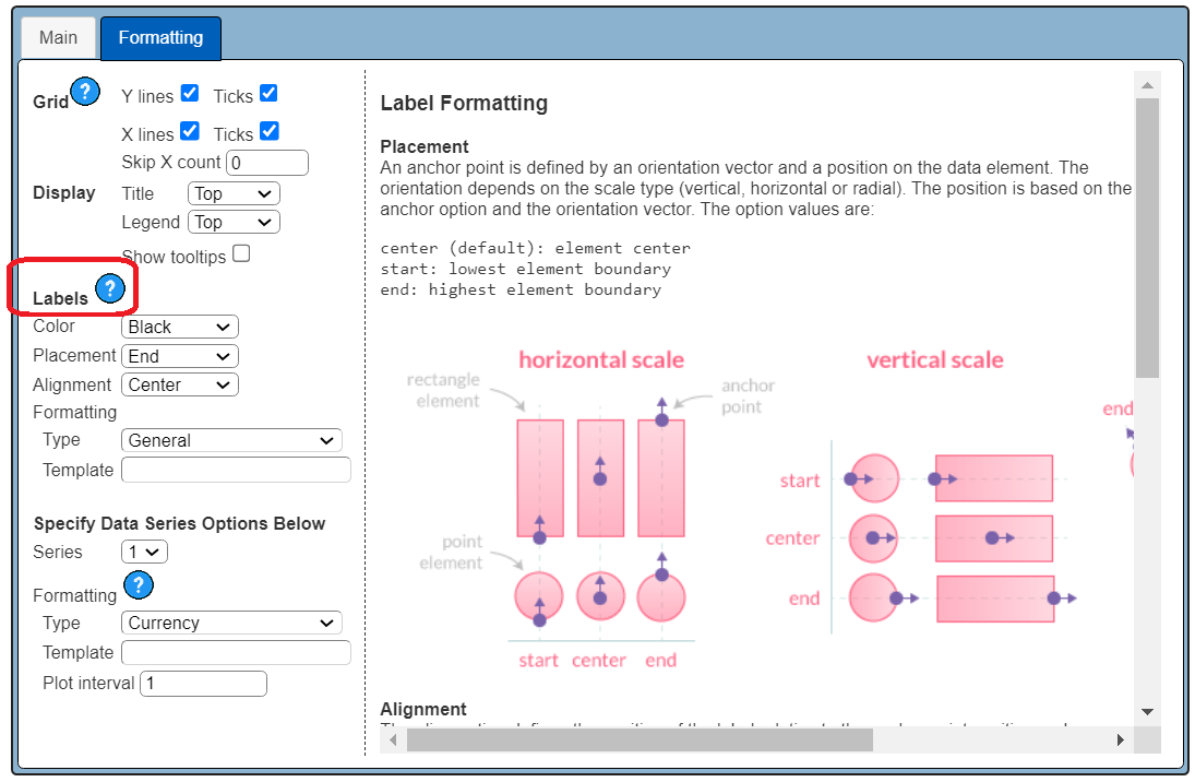
Setting Your X and Y Axis Endpoints
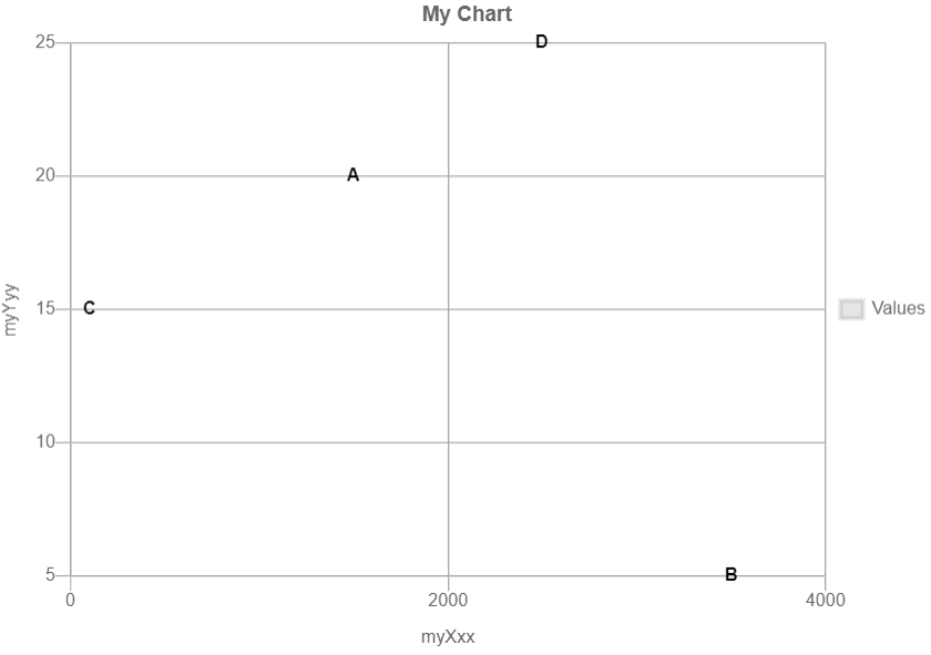
If not specific chart.js will decide the axis minimum and maximum values. At times you want to anchor the minimum though. For example, consider these bar charts.
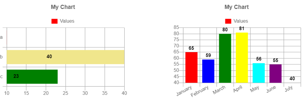
The first’s X starts at 10 and the second’s Y starts at 40. That may not be obvious to the viewer at first. This example can be found at “example/Custom cells/Chart.js colorful bar charts - default min”.
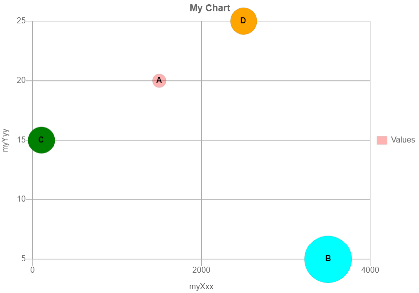
An axis minimum can explicitly be set to 0 in the Main tab as shown below.

The new results are shown below.
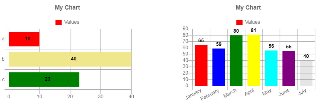
This example can be found at “example/Custom cells/Chart.js colorful bar charts - min of 0”.
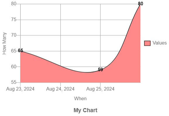
Line, Area, and Bar Chart Examples
Here are examples of plotting the same set of data across various chart types.
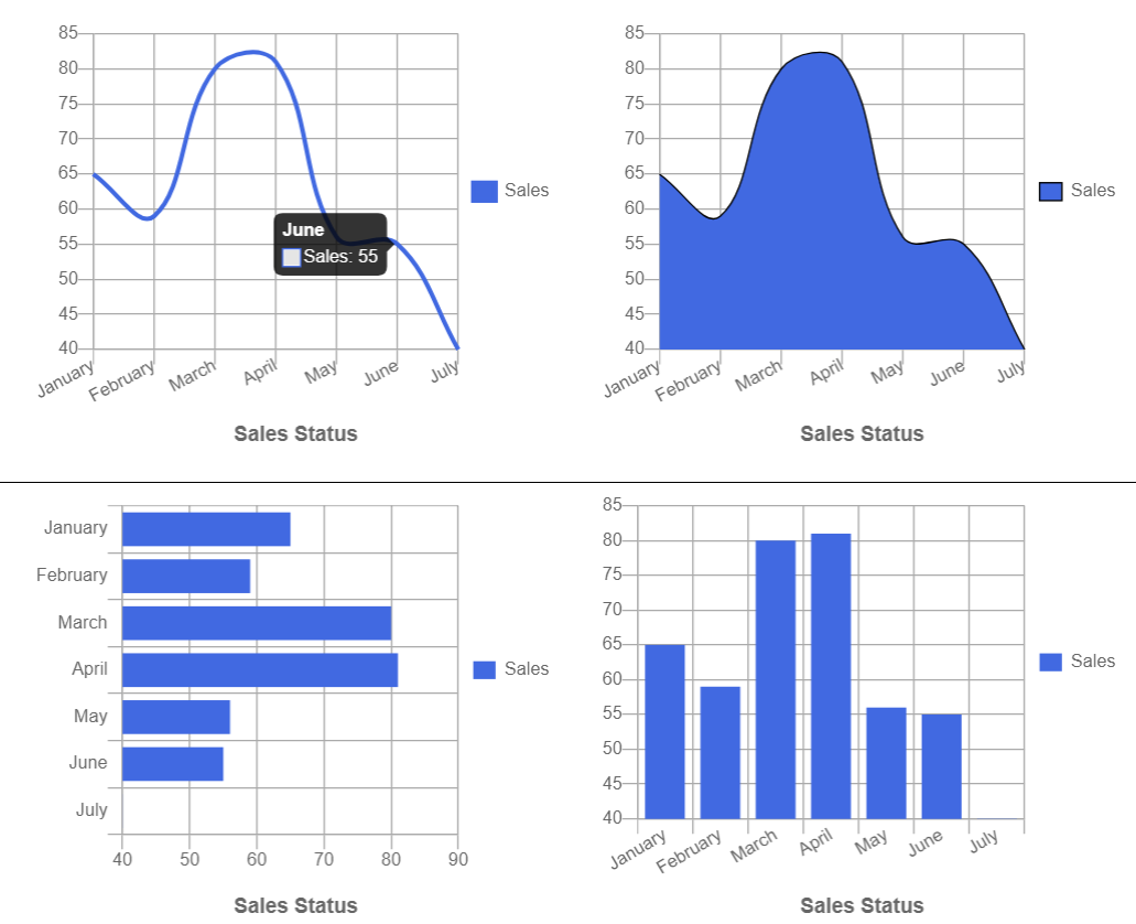
This example can be found at “example/Dashboard/Chart set 1”.
Pie and Doughnut Examples
Below are examples of pie and doughnut charts. The charts require labels and plot data list. Leaving the colors expression empty lets chart.js assign colors.
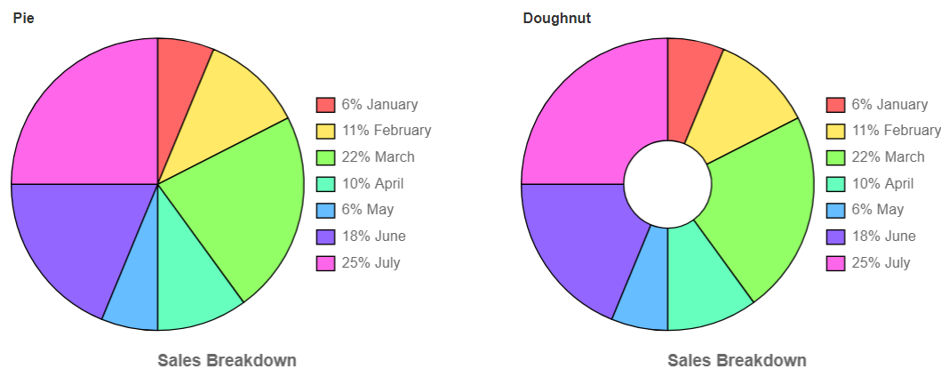
This example can be found at “example/Dashboard/Chart pie and doughnut”.
Polar Example
Below is a polar example.
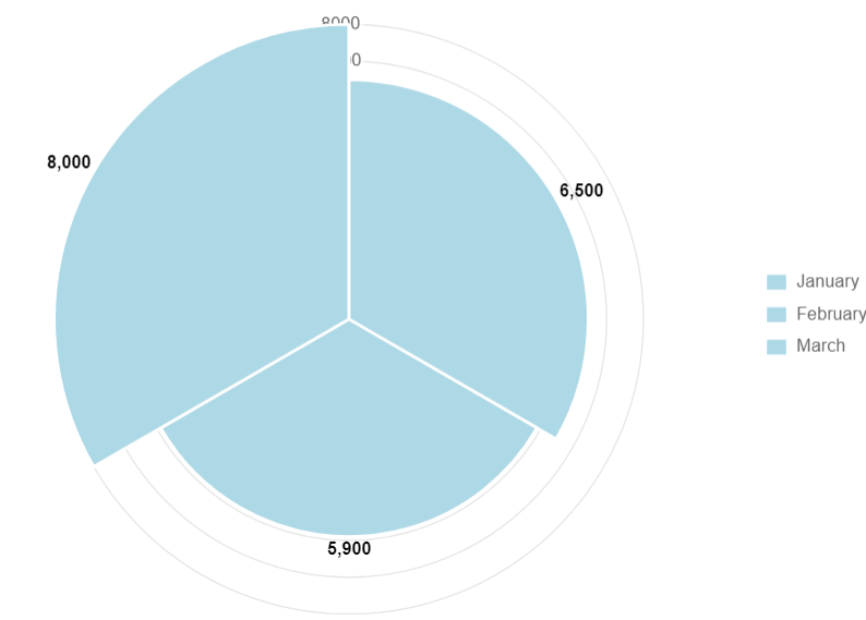
Its main properties are shown below.


This example can be found at “example/Custom cells/Chart.js polar data pts”.
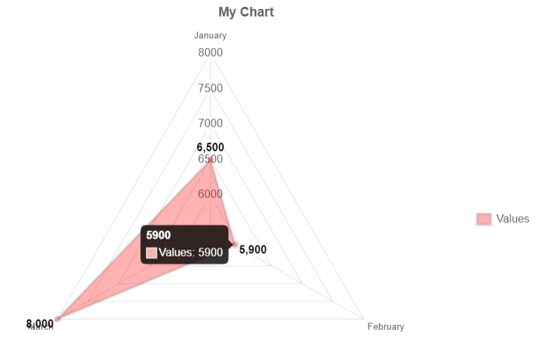
Radar Example
Below is a radar example
This example can be found at “example/Custom cells/Chart.js radar data pts”.
Scatter Plot
Below is a scatter plot example
This example can be found at “example/Custom cells/Chart.js scatter plot”.
Bubble Plot
This chart is similar to a scatter chart except it includes information about the circle size.
This example can be found at “example/Custom cells/Chart.js bubble data pts”.
Using Time Axis
There are many cases where an axis is a timestamp. Below is one example.
 The main tab has

The formatting tab has

This example can be found at “example/Custom cells/Chart.js 3 dates”.
Here is another timeseries example which shows the use of label skipping.
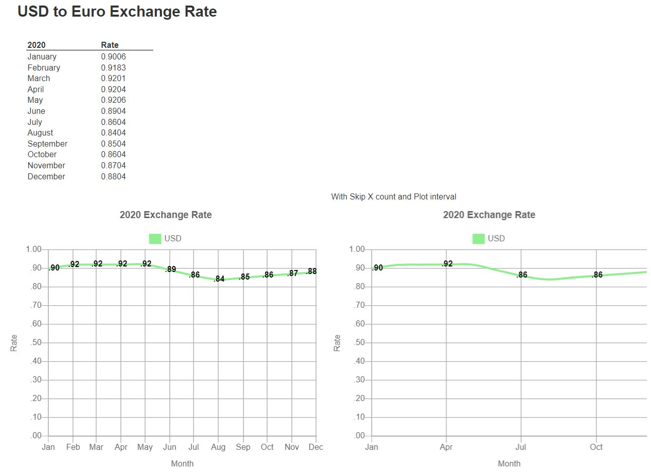
They both have these properties to format the label.

They both have these properties to format the value.

The second chart has the following tweaks which reduce the display values and tick marks.


This example can be found at “example/Custom cells/Chart.js USD timeline”.
Data Details plus an Accompanying Chart
Shown below is the result of a template which displays details and on the group summary displays a chart.
The data retrieved from the data source is shown below.
The custom cell’s main properties include the following.


This chart has 2 data series. The second one’s properties are shown below.

This chart uses the following macro function,
document = cjsElement(x, y [ , v [, r [, c [, t] ] )
It creates an object usable by chart.js with well known fields with:
Sales Report Charting Summary Values
In this example the charting data comes from the group summary lines containing the overall sales in a region. The snapshot below shows multi-page output of an analysis side by side.
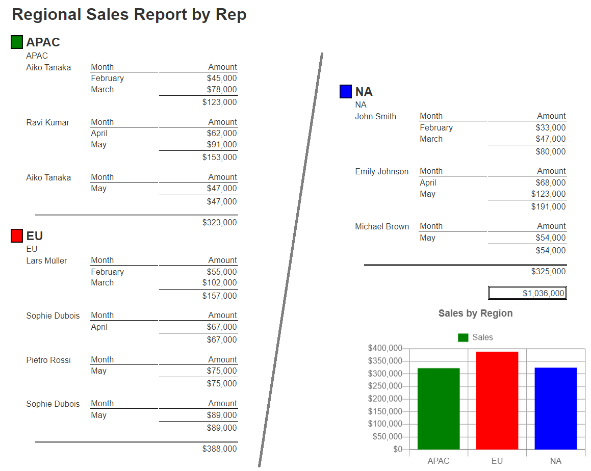
This example can be found at “example/Custom cells/Chart.js Sales report with region and rep groupings”.
Adjusting the Value Axis for Integers Grids
The snapshot below shows multi-page output of an analysis side by side. Notice the Y axis grid labels between the two.
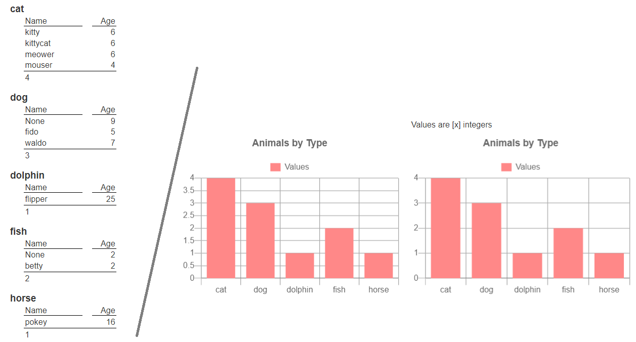
The left-hand chart just sets the minimum.


The right-hand chart additionally indicates the values should be treated as integers.

This example can be found at “example/Custom cells/Chart.js lines - aggregate animals”.
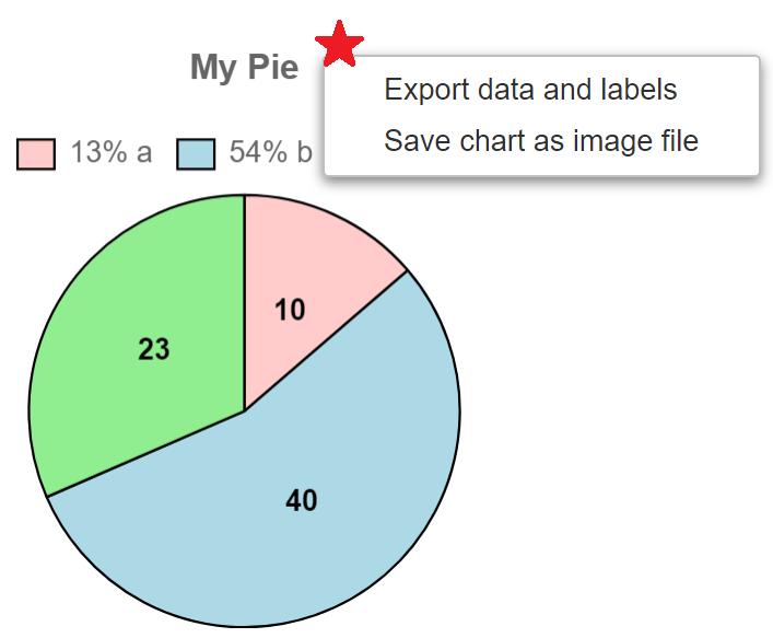
Popup Menu Options
Standard template cells can have popup menus in the result to perform interactive actions. With many chart.js custom cell chart types you can specify a similar activity. When the context-menu click is not in the data area a general purpose context menu is shown.
THe red star below is the location of the mouse at context menu click time.
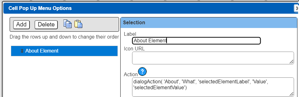
The template cell’s popup menu appears when the user clicks in the data area.
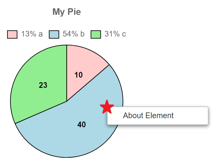
The menu actions can reference several well known values which are available when a data element (i.e., one of the vertical bars) is clicked upon. These values are “selectedElementLabel” and “selectedElementValue”. For example, the dialogAction() signature is
action = dialogAction(title, key1, value1, ...)
Here is an example of using it in a popup menu. The selection values are filled in at click time.
Action Related Macros
Qarbine provides several interaction options for menu options and buttons. A macro function is used to create an action object. That object is then triggered when its owning button is clicked or menu option is selected. Below are some of the action creation macros. See the Macro Functions documentation for more details.
| Action Creation Macros |
|---|
| action = askAiAction(text, aiAlias, options) |
| action = askAiPromptAction(fullComponentPath, aiAlias, options, key1, value1, key2, value2...) |
| action = componentOpen(componentObjectOrReference) |
| action = componentObjectAction([run,open, edit, copyReference], catalogObject, key1, value1, key2, value2...) |
| action = dialogAction(title, key1, value1, ...) |
| action = googleAction(what [, areaName]) |
| action = javaScriptAction(targetObjectName, fnName, value1, value2...) |
| action = urlAction(URL, Get|Post, key1, value1, key2, value2...) |